Tuesday, September 19, 2006 at 8:33 PM
by Ellen Beldner, User Experience Designer
As part of our ongoing effort to make Google Base easier to use, we launched a redesign of the Base homepage today. This doesn't change any functionality, but will make Base easier to understand.
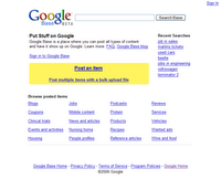
In our usability studies, we noticed that providers new to bulk uploading would often see the link "Post an item" and click it immediately. They often wouldn't notice the smaller link that said "Post multiple items with a bulk upload file". Our testers would end up in the one-at-a-time posting process, and they definitely did not like the idea of trying to add hundreds or thousands of items to Google Base by hand! With the new design, all of our testers were able to choose an upload technology that is right for their items. The new design also includes the choice of the Google Base API (which stands for Application Programming Interface).
The old Google Base homepage:
The new Google Base homepage:
One of the other changes is that we removed the search box from the Base homepage. In its place we've added more examples of popular and interesting item types -- like car parts and filmography -- to let Google Base providers get a sense of the wide variety of data they can post on Base. You can still search all the items on Base from your Active Items dashboard.
The new homepage launched in the United States and will launch in Germany and the United Kingdom very soon.


